Meet Ripple Mint
Ripple launches University Digital Asset Xcelerator (UDAX) in Brazil to boost the development of the XRP ecosystem
The XRPL Lending Protocol: Bringing Credit Infrastructure Onchain
Building the Future of Agentic Payments: Introducing the XRP Ledger AI Starter Kit
From Pilot to Production: A Fintech’s Checklist for Stablecoin Payments
One Year In: How Ripple's $25 Million Education Commitment Is Reaching Every Corner of America
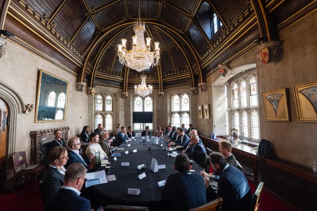
Beyond TradFi and DeFi: Accelerating Digital Capital Markets in the UK
More Stablecoins, More Markets, More Flexibility: How Global Payments Infrastructure is Evolving
Post-Quantum Readiness on the XRP Ledger